‘Do right by my community’: SOU design student’s logo embraced by Shady Cove
Published 4:00 pm Wednesday, March 27, 2024
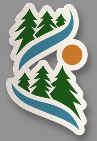
- SOU student Julia Jackson's main logo design for Shady Cove incorporates a a river running through the woods.
When Julia Jackson of Shady Cove enrolled in her Graphic Design Advanced Topics course, the Southern Oregon University senior could hardly imagine that it would lead to her first work for a client — and that her design would be embraced by her chosen hometown.
Shady Cove officials picked Jackson’s sweeping logo earlier this month from among 18 proposals submitted by SOU students in her 400-level design class. In the coming weeks, the design of a river running through a forest will adorn the city’s website, social media and much more — and replace the hand-drawn logo the city has used since its founding in 1972.
Among the first implementations of the new logo will be in the city’s welcome sign. Thinking of her logo adorning the sign symbolizes something she loves about graphic design: how an idea can start in her head, move to a computer and become a physical object.
“I like the aspect of taking something digital and making something physical,” Jackson said.
Her submission was part of a new partnership with SOU’s Emerging Media and Digital Arts program. It coincided with Shady Cove’s rebranding effort featuring the slogan:”Small Town. Big Adventures.”
Jackson will get a $500 scholarship from the city for creating the winning proposal, and the city is giving another $2,000 to a new EMDA program scholarship fund.
According to City Council president Kathy Nuckles, Jackson’s proposal was among four finalists who made their pitches to the council and “a very packed house” on March 7. The council also presented Jackson’s professor, Sam Hayes-Hicks, with a key to the city.
Nuckles said in an email to the Rogue Valley Times that all of the students “knocked it out of the ballpark” during the meeting, but their vote was ultimately unanimous.
“After Council discussion, we voted unanimously for Logo D (Jackson’s) because this very clean logo can ‘morph’ into almost any adventure,” Nuckles said.
Nuckles noted how Jackson’s proposal included multiple variants using the same teal blue, forest green and burnt orange color scheme. One depicted a deer or elk with antlers, another depicted a fish in the river.
Part of that adaptability came from a creative process in which she experimented with at least 50 designs, according to Jackson. She wanted to capture what she loves about the town she drove across the country in her van 12 years ago to call home.
She made a concerted effort to listen to her community during the design process. She started by searching Shady Cove on social media to get an idea of what people thought about the area. She also made a survey and posted it on a community Facebook page for input.
“I felt a need to do right by my community, if that makes sense,” Jackson said.
The city posted the top four designs on the city’s official Facebook page Feb. 29. Nuckles said that, for the first time in years, the public “truly engaged in a positive way.”
“We were getting all sorts of ‘votes’ and very constructive criticism,” Nuckles said. “I haven’t felt this sense of community harmony in a very, very long time.”
As of Tuesday, the city’s Facebook post had garnered 26 comments and 16 shares. Although a handful of comments expressed a preference for the city’s original hand-drawn logo, none resorted to put-downs. The bulk of the comments were enthusiastic for the new designs.
One poster praised another student’s proposal as “super simple and neat,” while a post commenting on Jackson’s design said the river going through trees “really tells a story of place.” Another called Jackson’s logo “absolutely perfect.”
Jackson said she’s normally a shy person, and voiced gratitude.
“I’ve never really had that kind of feedback,” Jackson said. “It makes me feel like I did a really good job.”
Nuckles said that Jackson and the university need another two to three weeks to get the logo ready for production, “and then we can start splashing it around town.”
“Probably the biggest task on our plate will be the replacement of our City welcome signs,” Nuckles said. “The new sign design will incorporate the new logo and slogan.”
Jackson said Monday that she is nearly finished fine-tuning her logo by making sure the pieces are perfectly in place and the colors are just right. She is also completing a “brand guidebook” — a common tool in graphic design that gives the city instructions on how to apply the different fonts and logo elements consistently.
“That’ll be an asset they can use, as well,” she said.
Jackson had no idea what to expect when she signed up for the graphic design course, she said. She remembers how one day, late in the fall, her professor, Hayes-Hicks, was excited about a new partnership.
“I didn’t know specifics, but I knew it was something big and cool,” Jackson said.
Jackson normally focuses on the screen-printing and laser-etching business called Distant Dimensions that she runs with her husband and features her whimsical space-alien-themed designs. The class marked her first time designing for someone else and experiencing the creative tension involved.
“When you actually have a client, you have to take into consideration what they want rather than what you want,” Jackson said.
She is grateful to have the design in her portfolio, but she’s not entirely sure what she will do after graduation.
Through her past three years in the EMDA program, Jackson has learned graphic design, animation and storyboarding, among other topics. She sees her business as a way to “mush” all the skills she learned together “and make something really cool.”
She originally enrolled in SOU as a business major before finding her passion in digital arts.
“I actually was going to be an accountant,” Jackson said. “I had to get back into something creative.”


2025 Community Choice Awards

-
-
-