OTHER VIEWS: Oregon’s state flag badly in need of updating
Published 5:15 am Friday, January 12, 2024
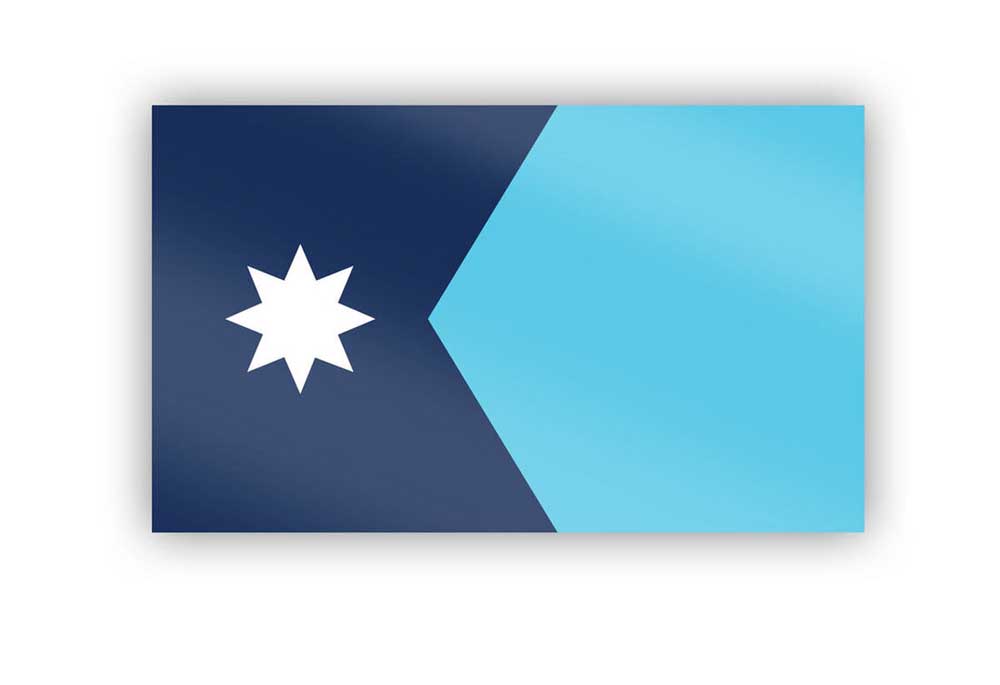
- The new state flag of Minnesota
Oregon legislators have plenty to deal with during the next session. There’s big issues that need addressing, from housing and drugs to inflation and education.
And, sure, Oregon voters have plenty to consider in consequential 2024 elections on local, state and federal levels.
We humbly ask to put one more thing on the to-do list for Oregon legislators and citizens: It’s time — long past time — for Oregon to get a new state flag.
We should start the process now so citizens and representatives have plenty of time to have their feelings heard on the matter and we arrive at a design that honors this place and its people.
Utah and Minnesota recently finished years-long efforts to design new state flags. Both states had boring blue backgrounds and yellow lettering, Latin words and complicated seals similar to Oregon’s current design.
Both states went through a long public process that included plenty of debate. And though not without controversy, both emerged with bold designs that symbolize their state’s geography and its people.
Oregon should do the same. Because our great state does not have a great state flag.
The obvious first drawback of Oregon’s flag is that it’s double-sided, the only state in the union with such a design. That means every flag flown atop the capitol or in front of a home costs 50 percent more to make than the average state flag. In addition to price, the double-sided nature undercuts the main reason to have a flag in the first place: A symbol that is easy to recognize from far away and at every angle.
Our flag also has too many words, including “STATE OF OREGON” on one side, which is kind of like having a bumpersticker that reads “CAR” on your car. There’s also some Latin that no one understands and a seal so unnecessarily complicated that you need a magnifying glass to make sense of it.
The colors are also bad — yellow on a blue background — the same as 23 other states. Boring.
On the plus side, there’s a stylized beaver. But on the downside, it’s unnecessarily small and often hard to see because it’s on the back of the flag.
Vexillologists (a person who studies flags) and members of the public agree — Oregon has a bad state flag that’s routinely among the lowest rated and least-flown in the country.
So why hasn’t Oregon done anything about it? A half-hearted effort was started around 2008, in anticipation of Oregon’s sesquicentennial the following year. But like a lot of Oregon projects, it never really got off the ground.
That’s a shame. Flags can be wonderful and invigorating and help us define ourselves and our home. They can rally and unite us — can give us a sense of place and pride. Oregon has lots to gain from redesigning and reimagining its preeminent image and logo. Here in Flag City, USA, Redmond knows how much a flag (or a couple thousand of them) can do for a place.
The are so many great options for a new Oregon state flag. The beaver. A covered wagon. An exploding whale. A silhouette of Mt. Hood. A salmon. A Douglas fir, reminiscent of the state’s great license plate. Or it could be geometric shapes or the perfect shade of blue, or we could task a great a Oregon artist like James Lavadour with a design of his choosing.
The possibilities are endless, so let’s start whittling them down now so we can arrive at one that Oregonians are excited about. Oregon deserves a great state flag.

